The Work
Choose the questions before loading everything
The source contains records collected through traffic-event APIs covering 49 states. I loaded the subset of fields needed for the analysis, including incident times, location, weather, and the traffic-impact score, rather than bringing every available column into memory.
I checked the meaning of the outcome before using it. The dataset’s Severity field measures traffic disruption on a one-to-four scale. It is not an injury scale. I grouped levels three and four for comparisons of higher disruption and kept that definition attached to the findings.
Make the comparisons consistent
I checked missingness and required start-time, severity, and state fields for the analysis. I converted timestamps and derived hour, weekday, month, season, and time-of-day categories. A city-and-state label helped keep cities with the same name from being treated as one place.
Weather descriptions needed grouping before they could support a readable comparison. I mapped variants into categories such as Fair, Cloudy, Rain, and Snow/Ice, while retaining an Unknown category for missing values. Unknown was excluded from weather-association tests rather than presented as an actual condition.
I used the same time and weather categories across the charts and statistical comparisons. That kept a change in grouping from being mistaken for a change in the underlying pattern.
Separate volume from the disruption share
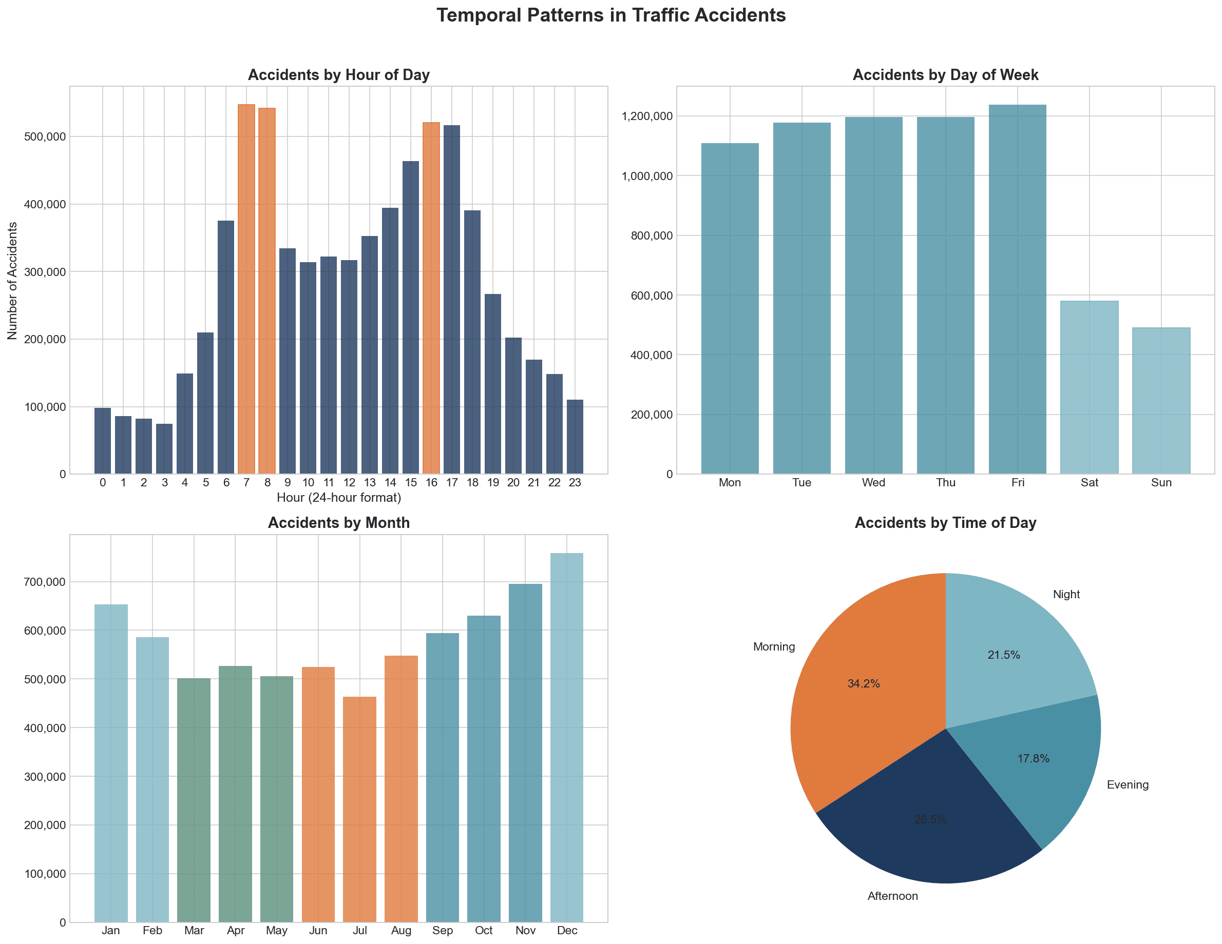
The notebook’s selected commute windows, 7–9 a.m. and 3–6 p.m., contained 33.5% of reported incidents across all days. That calculation includes records starting in hours 7, 8, 15, 16, and 17. Five states contained 50.9%. Those are concentrations within the records, useful for identifying where to investigate further, rather than rates per vehicle or mile traveled.
For weather, I compared both incident counts and the share with higher disruption. Rain’s higher-disruption share was 23.5%, compared with 16.9% for Fair weather. A category can have a large total without the largest disruption share, so the two charts answer different questions.
I used chi-square tests and Cramer’s V to examine categorical associations and their strength. The tests were statistically significant, but the associations were weak: Cramer’s V was 0.0972 for time of day and 0.0645 for weather. With millions of records, that distinction mattered when interpreting the patterns. I also compared adverse and fair-weather proportions, with a sensitivity check excluding Fog/Haze from the adverse group.
Turn patterns into response priorities
I proposed time-based staffing and safety messaging, weather-responsive warnings, and further investigation of geographic hotspots. The presentation connects each proposal to a finding and a metric that could be monitored if the idea were piloted.
A pilot would need local traffic-volume data, a baseline, and consistent reporting to evaluate whether a response improved conditions. The patterns identify places and times for further investigation; the next step is to test the proposed response in that local context.
| Finding | Response priority | Interpretation |
|---|---|---|
| 33.5% start in hours 7, 8, 15, 16, and 17 across all days | Evaluate time-based staffing and safety messaging | Share of reported incidents, not risk per trip |
| Higher-disruption share: Rain 23.5%; Fair 16.9% | Evaluate weather-responsive warnings | Severity levels 3 and 4 describe traffic disruption, not injuries |
| Five states account for 50.9% of records | Investigate geographic hotspots | Counts need travel-exposure and reporting context before comparing risk |
| Cramer's V: time of day 0.0972; weather 0.0645 | Keep response priorities proportional to the evidence | Statistically significant associations are weak, not predictive rules |
THE DELIVERABLES
What I delivered
- Python analysis notebook with preparation steps, visual exploration, statistical comparisons, and limitations.
- Exported analysis data for Tableau and a set of temporal, weather, and geographic charts.
- Interactive dashboard and presentation with three response priorities.
THE OUTCOME
Where the work stands
Completed a notebook, Tableau dashboard, and presentation connecting temporal, weather, and geographic patterns to three response priorities.
A FINDING FROM THE ANALYSIS
Weather and traffic disruption
Share of reported incidents rated high severity within each weather group. The dataset severity rating describes traffic disruption.
Association does not establish cause. These percentages do not estimate injury risk or account for travel exposure. Source: US Traffic Accident Analysis capstone.
SCOPE AND LIMITATIONS
What the work establishes
Completed as a Flatiron School capstone using public traffic-event data.
Severity measures traffic disruption, not injuries.
Counts are not normalized by vehicle miles traveled; reporting coverage and collection methods vary.
The analysis identifies associations; the proposed interventions have not been evaluated.