The Work
A membership question, grounded in trips
The case study frames annual membership as the business opportunity. The available records describe trips, so I could investigate how the two rider groups used the service. I could not ask individual riders why they chose a casual pass or whether a particular offer would convince them to subscribe.
I used those boundaries to keep the analysis focused. Duration helps distinguish shorter trips from longer outings. Day of week provides another view of use. Month adds the seasonal context that would be lost if I treated the entire year as one average.
One year of data, one comparison
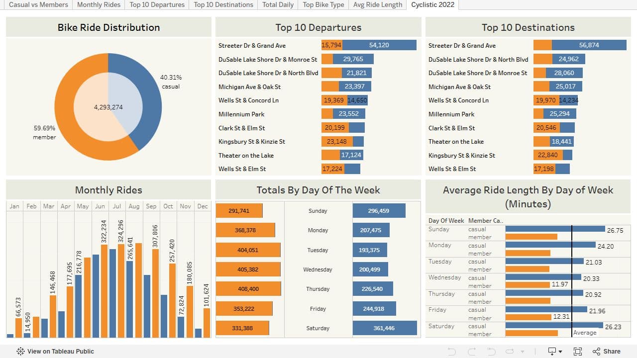
I combined twelve monthly files from 2022 into a shared working dataset in R. After cleaning, the analysis contained 4,293,274 rides. Combining the files gave me a full-year view while retaining the member-versus-casual distinction needed for the question.
I compared members and casual riders across the same measures in R: ride duration, day of week, and month. I then brought the results into Tableau, where readers could explore those views together and compare the timing and length of trips.
I kept ride duration, weekday, and seasonal views separate rather than forcing them into one headline. A difference in ride length answers a different question from a difference in total ride volume, and either can look different once the time of year changes.
- Checked column names and data types across twelve monthly files, corrected November’s timestamp format, and combined the files in R.
- Derived date, month, weekday, and ride duration fields from trip timestamps for consistent rider comparisons.
- Removed negative-duration and incomplete records, then excluded trips shorter than one minute or longer than fifteen hours from the final comparison.
- Compared rider counts and ride-duration summaries by membership type, weekday, and month, using ggplot2 and plotly to show the patterns.
- Used SQL in Google BigQuery to support exploratory analysis alongside the R notebook.
The groups did not ride the same way
Casual riders took longer rides than annual members. Their activity increased from May through September, and their volume was higher Friday through Sunday than Monday through Thursday. Together, those observations gave the membership question more shape than a simple count of the two groups.
The seasonal and weekly patterns suggest that a single message may not fit every potential member. They provide a reason to investigate leisure-oriented offers alongside a commute-focused campaign, while keeping those interpretations separate from what the trip records directly show.
Ideas to test, with a reason behind each one
I proposed seasonal promotions, rewards points, and a campaign around commuting. Those ideas connect to the observed behavior: seasonal timing for the warmer-month increase, incentives for repeat use, and a clearer explanation of the value of membership for a regular trip.
Each recommendation gives the membership team a specific idea to test and a reason for testing it. A pilot would need to track repeat use, subscriptions, and whether riders remained members after an offer ended.
| Observation | Proposed action | What a test would need to establish |
|---|---|---|
| Casual activity increases May through September | Seasonal membership promotions | Whether seasonal offers produce subscriptions that continue beyond the promotion |
| Casual volume is higher Friday through Sunday | Rewards for repeat use | Whether the incentive changes repeat use and membership conversion |
| The groups differ in ride duration and weekly use | A campaign explaining membership value for commuting | Whether the message fits riders who make regular trips |
THE DELIVERABLES
What I delivered
- R notebook documenting data preparation, comparisons, and recommendations.
- A working analysis of 4,293,274 cleaned 2022 rides from twelve monthly source files.
- Tableau dashboard presenting member and casual-rider patterns.
THE OUTCOME
Where the work stands
Completed a public-data case study that connects rider behavior to specific membership ideas, with the analysis available for review.
SCOPE AND LIMITATIONS
What the work establishes
Completed for the Google Data Analytics certificate using public trip data.
Trip records describe observed use; they do not establish riders’ motivations or a campaign’s conversion rate.
The proposed membership campaigns have not been tested.